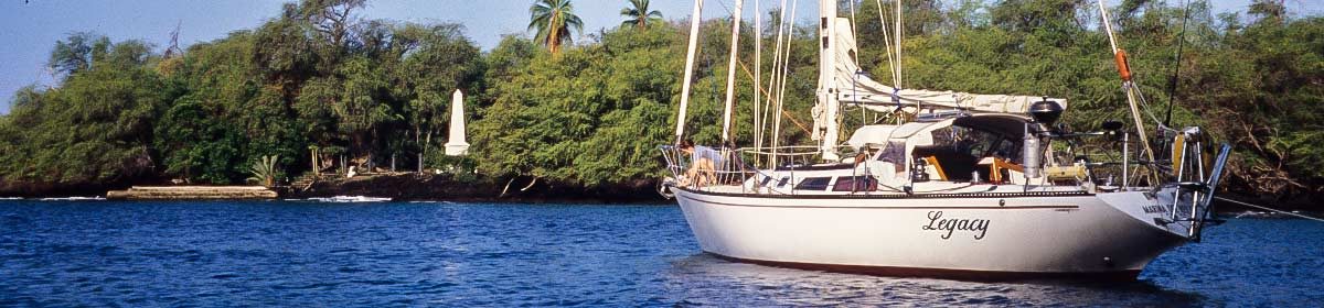
December 28, 2016
My sister asked us “what happened to Tasmania?” Nothing, as far as we know. It’s still there. Oh, that’s probably not what she meant. “Why aren’t you there yet?” and “Are you still going?” is probably what she meant and what we’ve been asked by other people who are incredulous that we’re so slow. Here’s the reason…
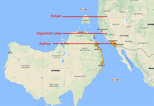
If you look at equivalent latitudes, you’ll see that Sydney is about even with Los Angeles. We came from LA. It’s too cold there for us! Where we are now (Gippsland Lakes) is about equal to San Francisco and I’m pretty sure no one lives in San Francisco because of the extreme cold. And where we’re going, Hobart, is at about the same latitude as Eugene Oregon – that town is just a rumor as no one’s ever braved the conditions to explore that far north.
OK, maybe I’m exaggerating about the cold a little bit and it is summer here while it’s winter up there, but it really is pretty cold still in Tasmania. Waiting a while will give us not only warmer days, but should also give us more settled conditions.
Another reason for our snail-like pace is that it’s nice here! We’ve learned that when we like a place, we linger. The next place may not be as nice, despite advanced billings.
Oh yea, it’s also a bloody long way between stuff in this giant country! You try driving the length of California at 5 miles an hour.
UPDATE, December 29, 2016
OK, while I was complaining about potential cold in the rant above, the heat snuck in yesterday and clobbered us. Below is a map from earth.nullschool.net showing what they call “The Zone of Misery!”
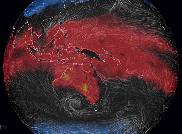
Here it is zoomed in with our location circled…

You can see the misery just creeping into Gippsland Lakes.
So it’s not only the cold we’re avoiding by not getting too far south, too quickly. It’s also the heat we’re running from by getting south quickly enough. Sheesh!
(On earth.nullschool.net, the zone of misery is labeled MI on their website map controls. I assume that’s “misery index.” The red area is where it’s miserably hot, and the blue area is where it’s miserably cold. Hopefully blue is not the subject of a future post.)
-Rich