April 5, 2015
Today, we motored around Cape Jackson. As it’s a long point that sticks out into the Cook Strait, with lots of water moving around it from the strait and from the sounds, we were cautious and sought local advice. “Stay close to the cliffs” was what we heard. OK, fine, but that wouldn’t be so easy with the lack of detail on our charts.
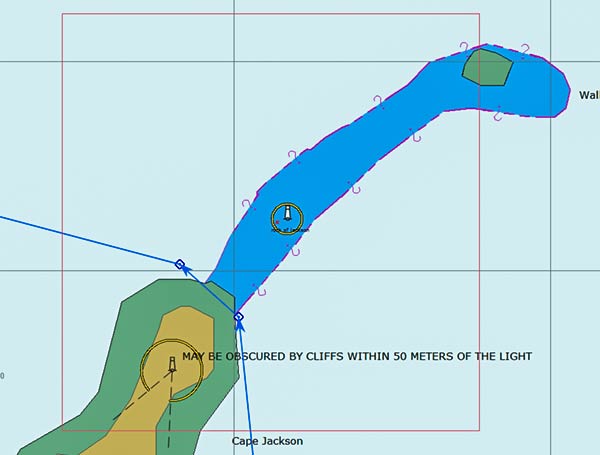
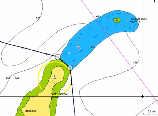
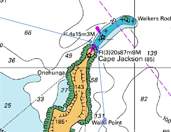
The line with circles or squares and arrows shows our route and the track we took around the point. All three of the above charts show us lifting Legacy out of the water to traverse the reef. We didn’t have to do that.
Here’s another example of Satellite images to the rescue.
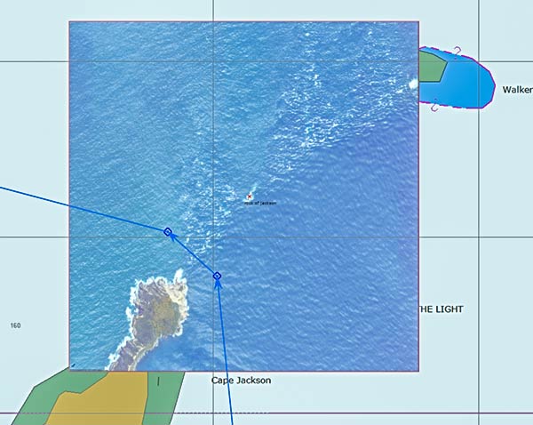
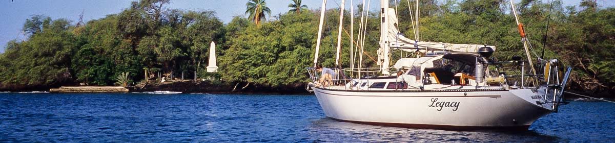
Above is a Nokia satellite image (KAP file) made with ChartAid. It clearly shows the rock with the old lighthouse offshore and the exact shape of Cape Jackson. We were able to stay close to the point as advised and had a very pleasant trip around to the Pelorus Sound.
In general, the Navionics charts have been marginal at best for the areas we’ve been in the sounds. Not as bad as in parts of Fiji, but not as good as I would hope they’d be. In some places, I’m pretty sure they just mimeographed James Cook’s drawings. Not only is the land shape off or dislocated, but they lack sufficient soundings and the soundings that are shown are most often inaccurate. This was a surprise to me after the spot-on detail we’ve seen in the North Island.
And to make matters just a little worse, the satellite images here are often pretty bad. Maybe it’s that this is too far south for a lot of satellite passes, but the images are often blurry, obscured by clouds, or extremely contrasty. I was lucky to find such a good image of Cape Jackson.
Even with these chart difficulties, it’s not been difficult to get around here. Reefs and rocks are often marked and the area is deep enough that bumping the bottom isn’t much of a danger if we just keep off the cliffs by a reasonable distance. -Rich