December 12, 2016
I’m not sure whether to level this complaint at Simrad, the maker of my chartplotter, or Navionics, the maker of my electronic charts. I suspect both share in the blame. (The issue is almost as bad on the iPad using Navionics charts so I suspect that I’m justified in using two fingers to point blame.)
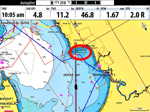
My complaint is the way text is handled on the these electronic charts and chartplotters. We were looking for a spot to anchor a few days ago in Jervis Bay. The place suggested by our guide book said “no anchoring” on the Navionics chart. See screenshot below…
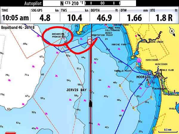
We scrambled around for a while trying to figure out where we might anchor and why it said prohibited in our spot. On the internet, we found a map with the Jervis Bay rules. It said nothing about an anchoring prohibition in this area. I zoomed into the chart to look at other areas and when I did, the note moved to the area that our rules agreed was a no anchoring zone.
This isn’t the first time we’ve seen magically moving (or changing text) but this is ridiculous. This would be like the timestamp moving over our faces when we zoomed in to take a picture with our camera…
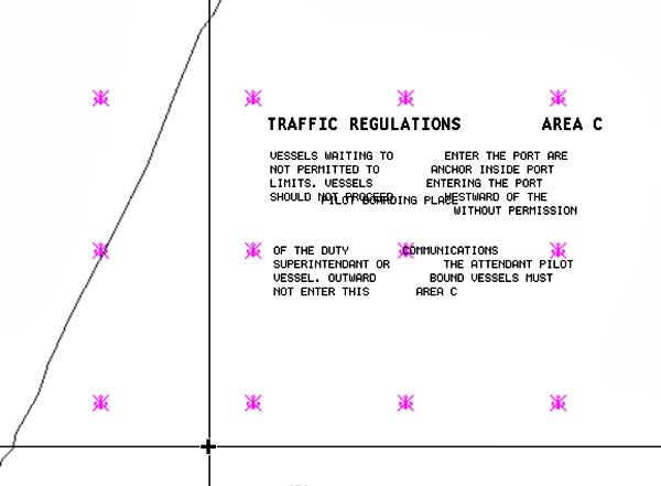
Most often the text error I see is that it’s broken up into multiple sections and sometimes those sections are disarranged, so interpretation becomes an unwelcome game.
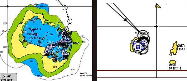
And maybe the best text-blunder of all is when the spelling of a place changes as you zoom in and out. See it here in Fiji’s Southern Lau…
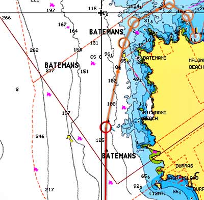
Today, we’re headed to Batemans Bay. This is what I found when I fired up the chartplotter this morning…
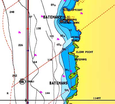
It seems we have three Batemans to choose from. Oh wait…
There are two more Batemans further north. Five?!
Come on guys, you can do better. It’s not like someone’s life might depend on your product! (Oh, I forgot, each time my chartplotter powers up, I have to acknowledge that this it’s for entertainment purposes only, like a video game, and not to be used like a multi-thousand dollar navigational tool!) -Rich

